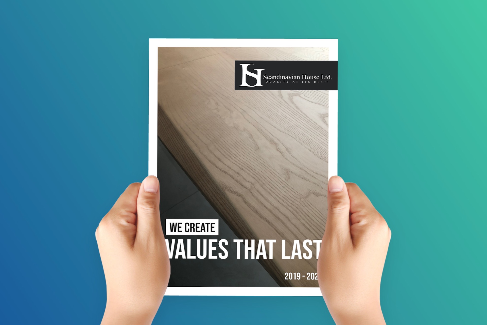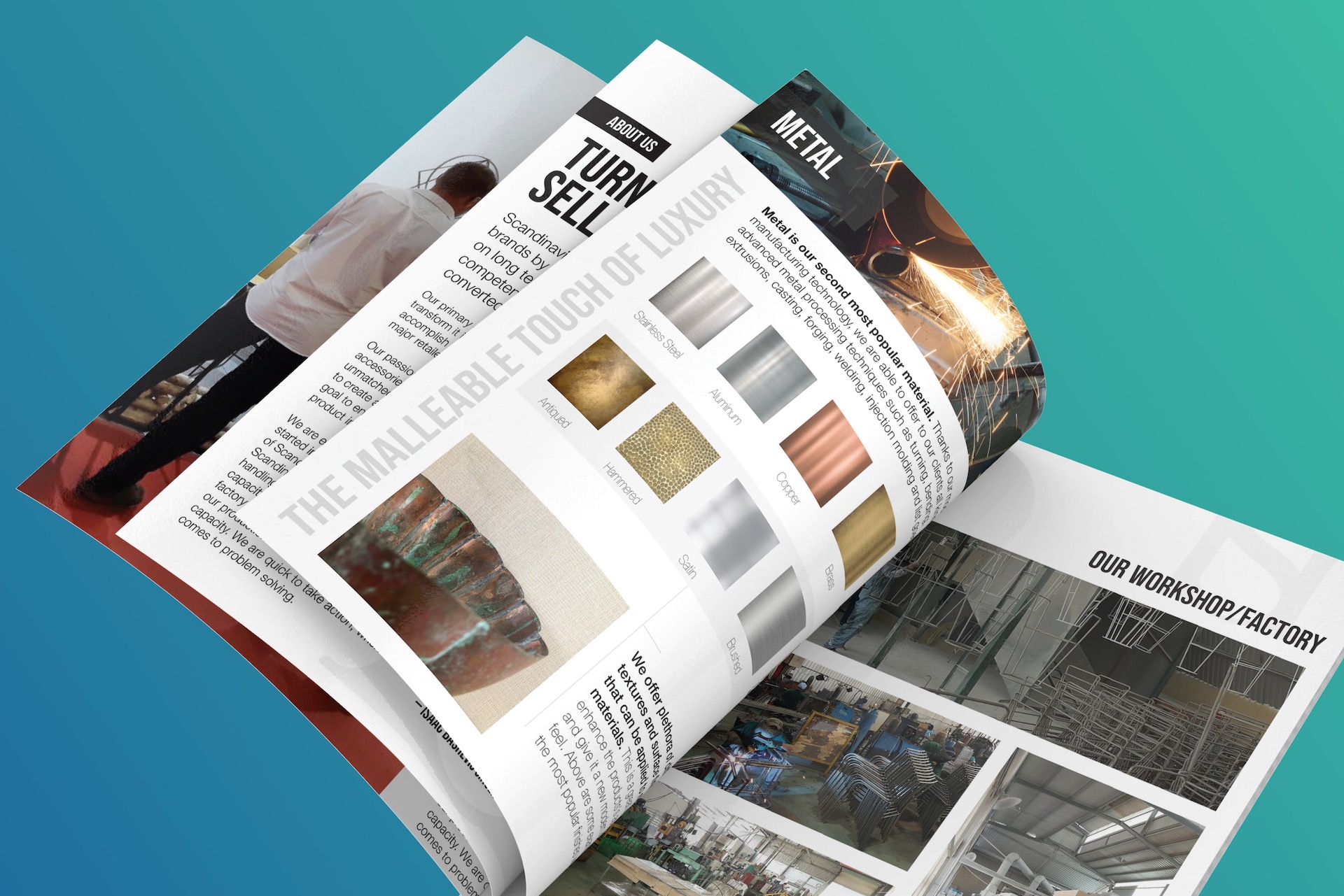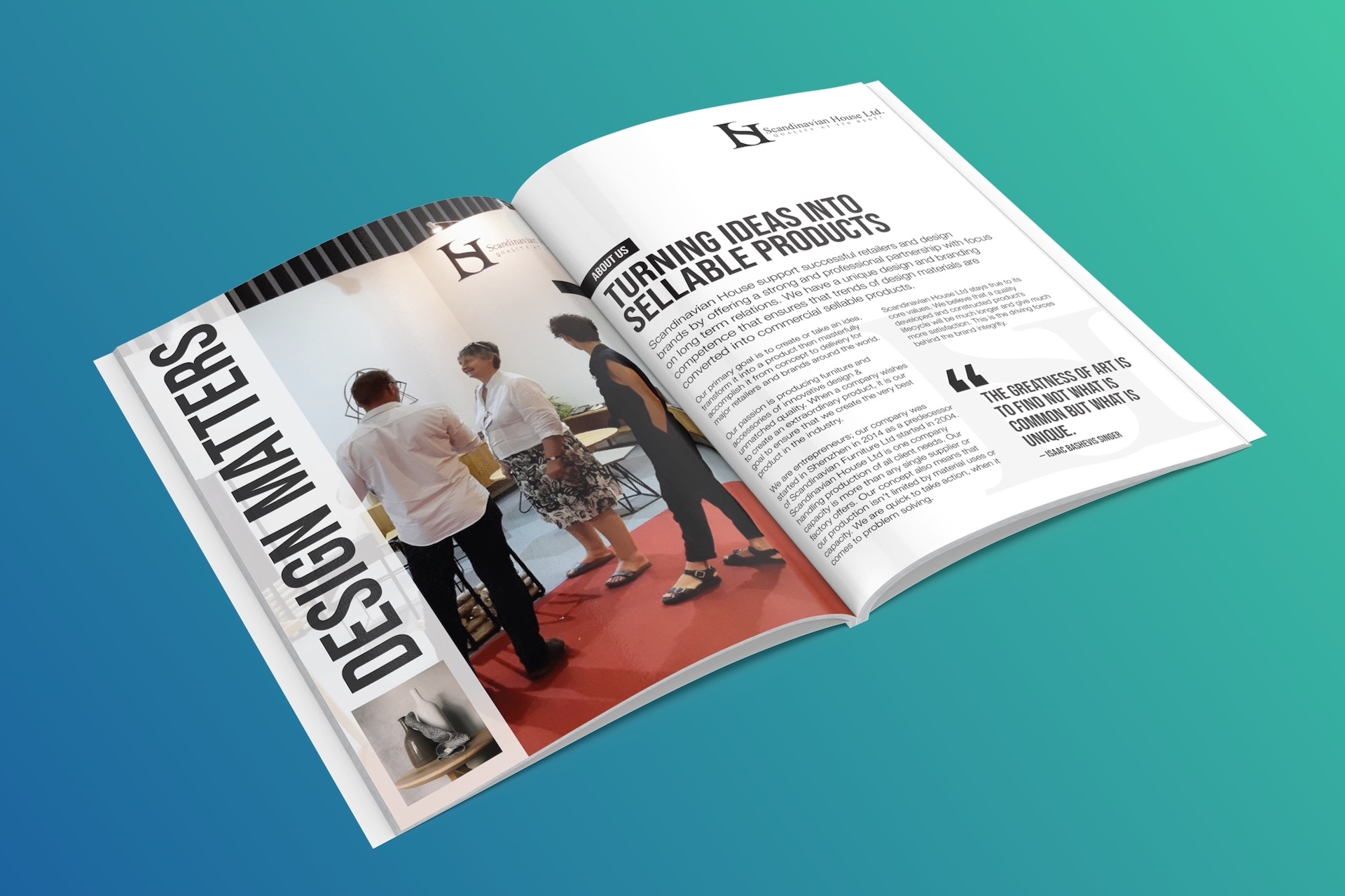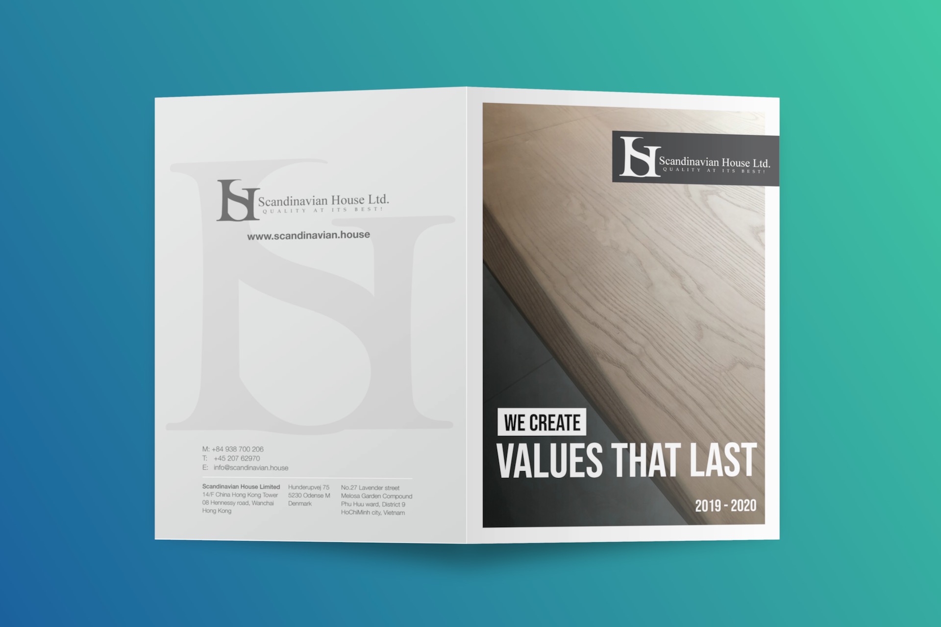
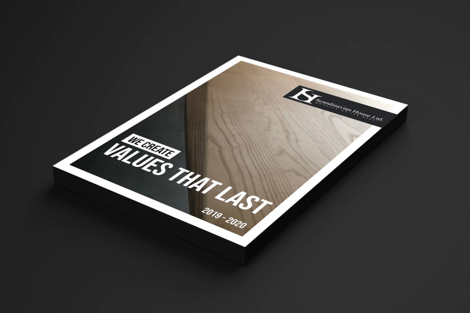
As a graphic design I’m often asked to either review existing designs or to take over unfinished projects and turn them into finished, higher-level marketing products. I enjoy working with clients who seek functional quality. The outcome of our collaboration must serve their primary business goals. The first iteration of Scandinavian House annual brochure was nicely laid out. However, it was missing a few key marketing features. Most content pages came across as unfinished, featuring very flat typography and rather chaotic or completely missing hierarchical content structure.
Turning the “below-average” into “above-average”
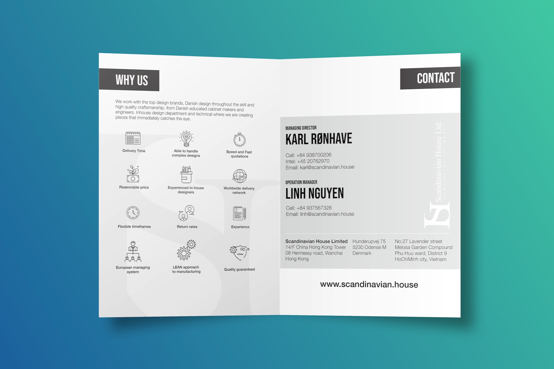
To address these issues I have re-written the old content to better fit my client’s marketing needs. I introduced couple of new headlines and catchphrases. Also I have adjusted the page layouts and introduced a more generous use of white space. The intention was to bring forward images and some key messages. Additionally I have implemented new, more hierarchical typography for better content absorption.
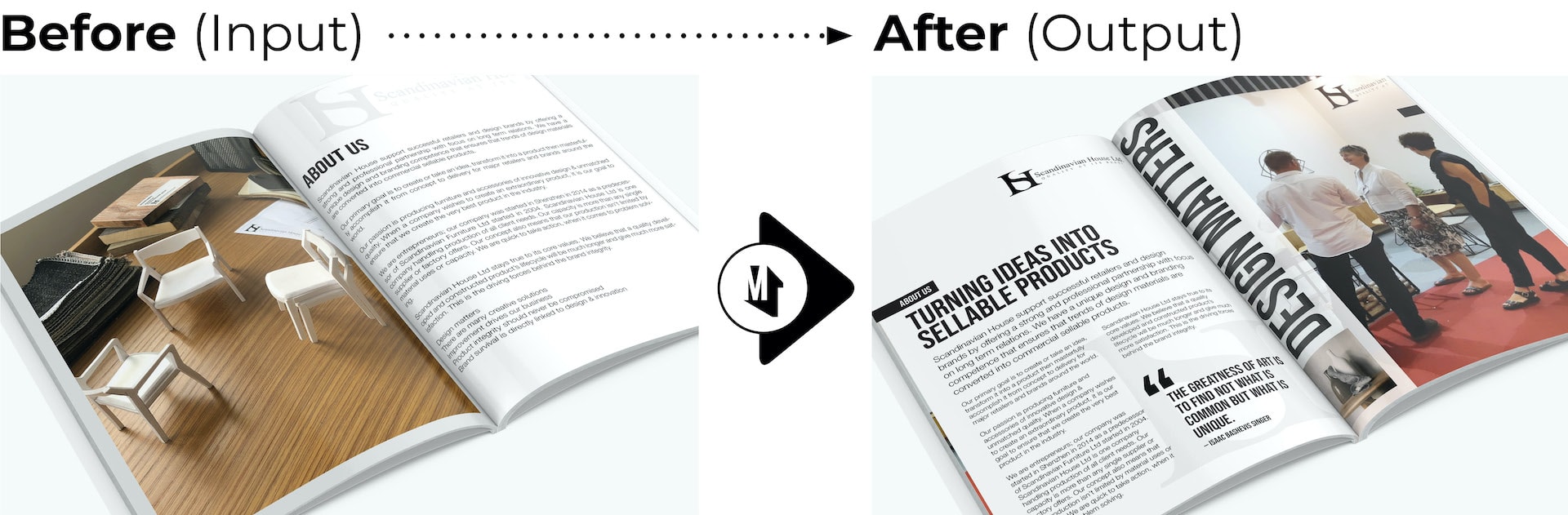
Bolder typography, more hierarchical content structure, clever use of white space and large images.